Description
Editors Charlotte Roberts and Bertie Brandes have teamed up with design titan Richard Turley in one of the most exciting collaborations of the year; the result is editorial design at its most emotive and special. We talked to the trio ahead of publication, but first some thoughts on the issue.
It’s fascinating how Mushpit has developed from zine to bigger, glossier magazine format. I was intrigued from the moment I saw issue seven; then I met Char and Bertie and was hooked – their mutual chemistry was the living personification of the magazine. Following issues sharpened their wit further, retaining the slightly self-conscious anti-design feel as they employed multiple visual references and cues to parody advertising and other media. It was irresistable: at once hilarious and serious while always 100% on target against their chosen bogeymen (and it was, generally, men)
The tenth issue ups the ante and sees the magazine leap ahead of itself, striding beyond cautious parody and establishing its own rules. Adding Turley to the mix was bound to shake things up but this is an earthquake. Earlier issues pale in comparison, as he applies his spare but thrilling graphic touches and establishes the confident visual identity Mushpit has been lacking.
While part of the appeal of Mushpit was this very lack of clear visual identity, it now has a really strong design aesthetic that is familiar from the more extreme elements of Turley-era Businessweek (as well as his more recent work on Good Trouble). And that aesthetic turns out to be the perfect foil for the content.
To state the obvious, the difference between Businessweek and Mushpit is the content; this is important because here we see Turley working in sympathy with the content rather than slyly bending economic and business stories into new shapes. The design is full of quirk and character while refreshingly clean, spare and urgent– there is little on these pages that is unneccesary. If earlier issues had the muddy colour and typography of Photoshop, we now see the Mushpit world via the pin-sharp glare of InDesign.
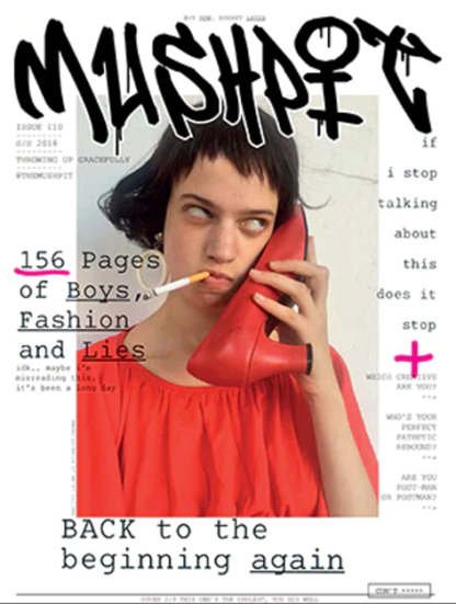
The cover (the one above is one of a choice of three) sums this up perfectly; a typically ironic Mushpit image is accompanied by the new tag logo, typewritten coverlines and handwritten details against a bright white field. It looks effortless.
Throughout, the issue is a thrilling example of the potential for design to improve content. It is editorial design at its highest level, as the familiar, clever editorial twists and turns are sent spiralling by their visualisations. The Mushpit world of boys, social media and twentysomething angst is brought to vivid life on the pages.
A valid criticism of indie mags is their reliance on a templated design approach, something that Mushpit never suffered from, but the impression of spontaneity on every page remains is enhanced by the new sophistication of the design. Char, Bertie and Richard are rightly excited by the results, and its arrival so late in the year gives us a wonderful, late Magazine of the Week to enjoy.


Reviews
There are no reviews yet.